For the second year I was proud to be asked by the Maryland Jockey Club to create gift souvenir plates for the owners of the horses entered in the 136th Preakness Stakes! I'm sorry I haven't been posting much lately but I wanted this to remain a surprise until the presentation day so I didn't want to show anything online. I took some pictures as I worked, which I'll share here. I'm not a very good photographer but I hope you'll get the idea! I loved doing this work and I hope you enjoy taking a peek at the process.
First, I like to tie the plate design to the Preakness logo. For each year, there's a new one. This is the 2011 logo design and a few of my sketches based on making the plate tie in with it.
 |
| A few rough sketches in Photoshop |
 |
| Final design choice. "Triple Vision" was used for design purposes only and was not a Preakness runner. |
I printed the design out a couple of times and created templates for the top graphic and the jersey and cap. The horse's name would have a guideline only and be painted freehand. The paints I used are
Folk Art Enamels, which are acrylic paints designed to be used on glass and ceramics.
 |
| Top graphic template |
 |
| After the template |
 |
The ribbons on the top graphic were created using templates as well. The type at the bottom was painted freehand using a guideline like the one in the center area. At the time this picture was taken I had already scraped off the guideline. Smoothing edges and scraping off guidelines was done with an X-acto knife.
|
 |
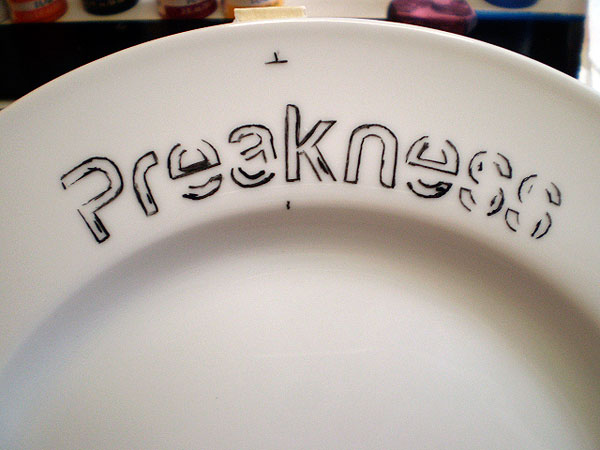
| Freehand painting of the horse's name |
 |
| The last step is painting the jockey's silks |
 |
Bad lighting and photography aside, this is what
the final product looked like. |
The painting of these plates involved a lot of scraping and repainting. Any time a letter looked bad or I damaged one too badly trying to perfect the edge I had to scrape it off and start over. I found that the freehand painting of the horses' names was the hardest part of the painting because it was difficult to space the letters properly with each other and to space the name as close to center as possible. The letters also have to be pretty close to the same size. Due to all my "perfecting", each plate took approximately 5 hours to paint.
 |
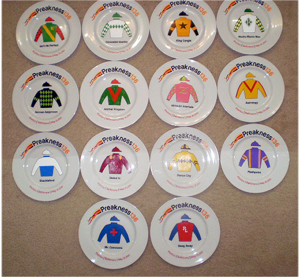
| Here is a picture of all 14 finished plates! |